Monday, February 27, 2012
Writing Assignment
I think the interesting composition in my photos is that object itself already has shape (round shape), and these objects make shape by themselves like a line, triangle, and square. Also, the main object's round line and other subject (background)'s straight line make good contrast. I believe all my photos have good depth or layers.


Thursday, February 23, 2012
Photo Idea


Both photos are taken by Waleed Almotar.
http://www.flickr.com/photos/7668450@N05/
Both photo have good compositions. The first photo has very strong color contrast, and interesting idea. it looks flat, but has depth also. The purpose is clear. The second photo has good balance and depth. The main object (a boat) is not that big, but absolutely get people's attention first. The color gradation is also beautiful. From left to right the color gets thicker, and this direction is the same with the boat's direction.
Monday, February 20, 2012
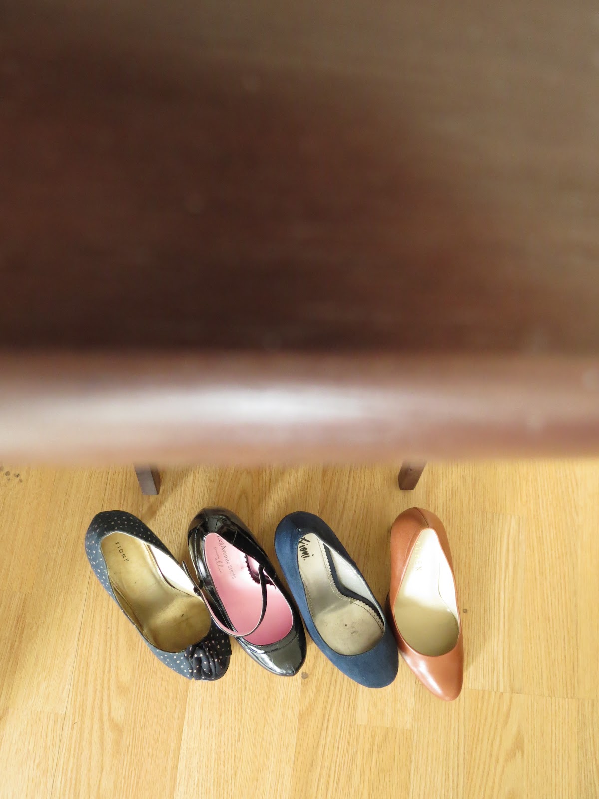
Assignment

1. composition: I could organize three shoes a little bit more.
2. lighting: purposely, I made edges darker, so main area can get attention.
3. clear focal point: focal point is the center of this photo, but I should unfocused the background more.
4. clear purpose: I think people can guess this photo is the moment a girl is choosing shoes for a day.
5. the subject is interesting: subject itself is not that interesting, but angle is interesting.
6. unique perspective: the angle is interesting. the view point is the model's view point.
7. creativity: I think it better than a photo that is just shoes in.
8. depth of the image: I has depth definitely, but unfocused background would give more depth.
9. emotional response: For women, I think it is a little bit emotional because choosing shoes since women like shoes.
10. technical skill: This photo can develop more, so technical skill is not enough.
Opposite Concepts
 |
| Low |
 |
| High Low photo, I unfocused the front object (table), so you can see the distance between shoes and top of the table. High photo, the shape of the door gives more hight in photo. |
 |
| Close |
 |
| Far Close photo, I focused on the very front part of a shoe, so I can get unfocused area a lot. Far photo, I focused on the corner of the table, so that gives a depth to this photo. |
 |
| Balanced |
 |
| Disordered Disordered photo, I even used distance to make disordered. |
 |
| Color |
 |
| Black and White I used my camera's pre setting, and used vivid color and black and white. |
Wednesday, February 15, 2012
Photo Idea

Quake Japan / Funeral
photo by Carlos Barria
http://www.poyi.org/69/05/ae02.php
This photo has layers and facts. The front layer is a coffin with people. I think this layer represents the truth of the grief. Too many people lost their family and friends. The middle layer is coffins with nobody. Even now, people cannot find their family or friend even their bodies, and many dead bodies are still unknown too. Some coffins are with flowers, but most of the are just plain white coffins. The last layer is with people who are carrying a coffin. Even, how terrible it is or was, people have to do what they had to, and it just looks like a job to do. I think this photo has every moments of 3.11, and also lighting is very effective, and it has depth. I really like this photo.
Monday, February 13, 2012


Sunday, February 12, 2012
Assignment : attention
My opinion to focus people's attention to the main object is to make something different. For example, I can make the main object looks bigger, or I can use lighting technics, and make a difference like putting a lot of light on the object. I can say the same thing to the depth. It also has a difference, so making a difference is the way to focus the attention on the main object. Also, movement is one of the ways. For example, I can just take a photo of an apple with a white background, but it is just so boring and there is no attention to the photo, so instead of using a white background, I can make a stream, gap and movement behind the object, and make your eyes move. I think this is also a good way to get attention.
Tuesday, February 7, 2012
Photo Idea

Taken by Meagan Visser
1/400s, f/2.8, ISO 400 with 100mm lens
http://www.meaganvisser.com/2011/05/revamping-your-etsy-shop-2011-blog-series-photography-pt-2/

Taken by Joshua Hudson
1/640s, f/2.8 with 180mm lens
http://camerachronicle.wordpress.com/2008/06/28/fun-with-fstops-the-secret-of-f28/
The first photo is focused on the center, and the soft area is outside.
The second photo is focused on the 4th person, and other people are in the soft area.
The reason why there are soft areas on these photos is instead of using wide aperture like f/32, they used narrow aperture like f/2.8, so they can get focus and soft areas on the same photo.


Best photo-3 2/7/2012

This is good contract against photo #2 because it is opposite. Unfocused on the front object and focused on the background.


Monday, February 6, 2012
Assignment 2
- It was a little bit uncomfortable because I did not know which moment was pictured. Especially, when I had to pose. I cannot see myself, so I wasn’t sure I was doing it correct and my face made a natural facial expression. On the other hand, when my partner was taking random picture, and I didn’t have to worry about posing, I wasn’t that uncomfortable.
- I think talking will help, or knowing each other well before we start taking pictures. Try not to ask to pose a lot, try to tell the person to be natural as much as they can.
Subscribe to:
Posts (Atom)